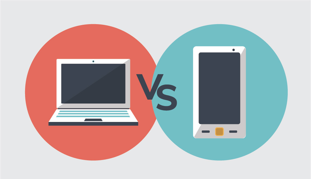
As UX professionals, we always pay a lot of attention to user’s need. When designing for mobile devices, we are aware of a few differences or better to say “constraints” as to web or desktop design.
In this post, I would like to talk about how to work within the mentioned constraints and deliver great user experiences. I will discuss how to design for mobile users and how it is different from designing for web or desktop users. We will also talk about four mobile constraints that we need to consider while building any mobile app.
First, let’s define what the attributes of a web or desktop persona are.
Web or desktop users’ devices are always plugged into power, which makes the users able to work for unlimited hours. These users generally have a constant internet network that is fast and reliable. They also have a big screen to work on and some sort of physical keyboard or a mouse or a touchpad. Most importantly, they are usually seated focusing fully on their tasks. Additionally, on desktop or web, users can fully close applications they are done with and there is usually little process happening in the background.
Now let’s take a look at a mobile persona.
Mobile users have a finite data plan and finite battery. They also have divided attention since they usually perform multiple tasks while interacting with their mobile devices. Unlike desktop users, mobile users interact with a small screen and because they are usually on the go, they might not have access to a reliable internet network. Most importantly, they are handedness.
As you can tell from personas, there are a few constraints in designing mobile apps that should be taken into consideration; but don’t get me wrong: constraints are not always bad, in fact, innovation is spurred as a result of constraints and let’s not forget the power that a mobile user has. They can enjoy amazing real-time location-based experiences that are simply not possible on web or desktop.
Now let’s dig dipper into a few mobile constraints.
Handedness
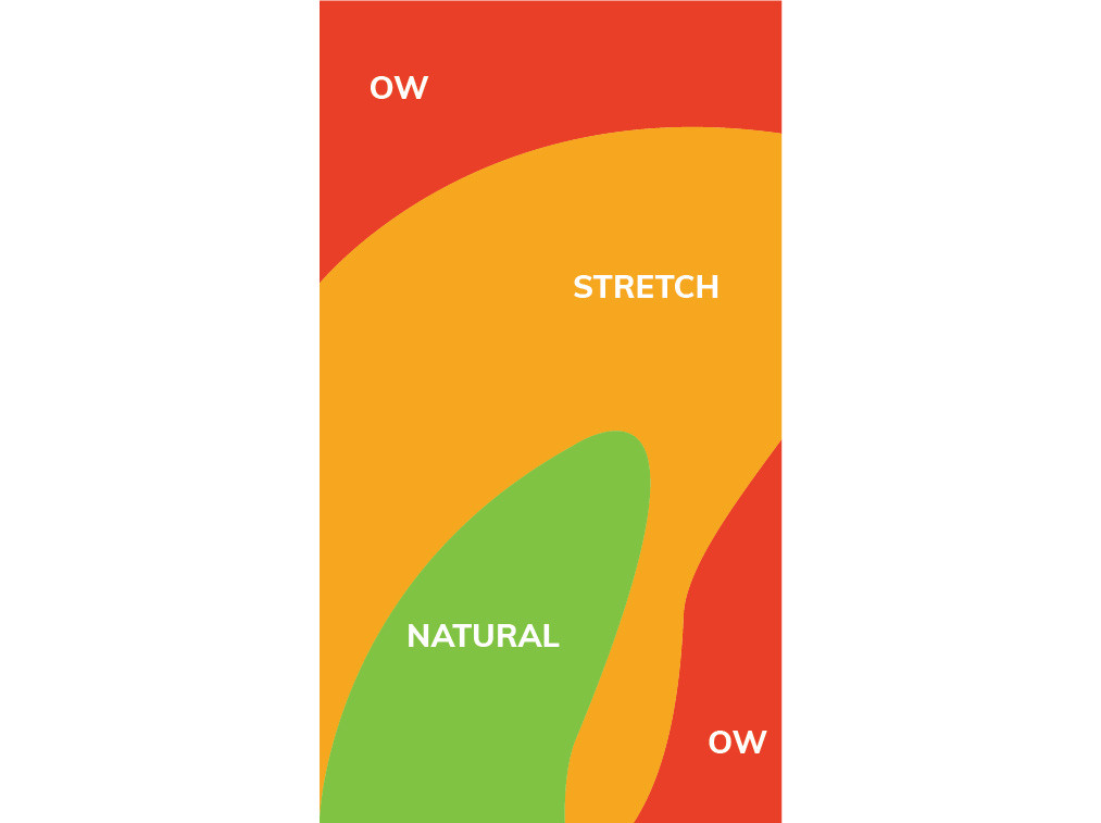
You might have heard about “OW zone” before but if you haven’t, let me explain it to you. First,
let’s review some interesting statistics. Based on a research by Steeve Hoober 49 percent of
smartphone usage occurs with a single hand. As shown in the below picture, red areas called
“OW zone” and we should be avoided as it’s hard for the user to reach that area. Instead, we
should try to place interactions mainly in the green area which is called “Natural zone”.

So, handedness is a kind of users need analysis by making applications fit in their lives in a way that they are comfortable performing tasks.
You might now ask how designing would be possible with all these constraints?
Regarding handedness, we as designers should decide if our users’ experience is one-handed or
two-handed and then place elements accordingly.
Considering limited data and battery life and unreliable network, we should be mindful of information that the user needs to download in a way that the app would not drain the battery and would work in offline mode as well.
As for divided attention and small screen, you have to make sure that the user interface is built in such a way that it doesn’t overwhelm the user with too much information.
